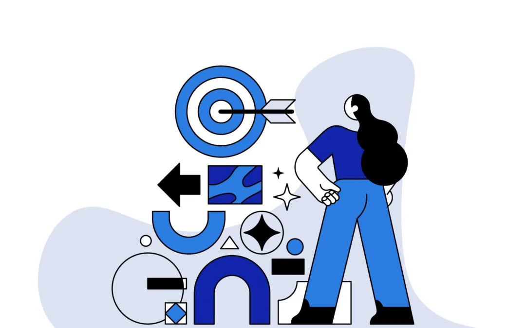
Basic Graphic Design Principles can elevate your brand. Discover key techniques to captivate and engage your audience effectively.
Have you ever looked at a visually stunning website or flyer and wondered how it’s made to look so good? The secret isn’t just creativity—it’s mastering the basic graphic design principles that guide every professional project.
For small businesses, the visual first impression can be a make-or-break moment. Yet, many small business owners face challenges like mismatched color schemes, cluttered layouts, or logos that don’t quite resonate with their target audience. These are not just minor hiccups; they can significantly impact how your brand is perceived and, ultimately, your bottom line.
In this article, we’ll demystify the basic graphic design principles that can transform your business’s visual identity. From achieving the right balance to using contrast effectively, these foundational concepts are powerful tools to enhance your branding and marketing efforts. We’ll explore each principle, offer practical tips for application, and highlight common pitfalls to avoid. Get ready to give your business a visual edge that captures and keeps customer attention!
Table of Contents
7 Basic Graphic Design Principles Explained
Balance

Balance is a fundamental concept in graphic design, crucial for creating visually appealing and harmonious layouts. Think of it like the scales of justice—each element in your design adds a certain weight, and how you distribute these elements affects the overall stability and attractiveness of your design.
There are a few different types of balance you might consider:
- Symmetrical Balance: This is all about mirroring; what you place on one side of the design, you replicate on the other. It’s like a butterfly’s wings—equal, harmonious, and pleasing to the eye. Symmetrical balance is great for conveying professionalism and stability.
- Asymmetrical Balance: Here, different elements have different weights but still achieve a pleasing equilibrium. It’s a bit like a seesaw with a small dog on one end and a big cat on the other, yet somehow perfectly balanced. This type of balance can make designs more dynamic and exciting.
- Radial Balance: Imagine a spiral staircase or the petals on a daisy. Elements radiate out from a central point and lead your eye in a circular motion. It’s used less often but can create a strong, impactful visual experience.
By mastering these balance types, you can enhance your design’s appeal and make sure it communicates your message effectively and beautifully. It’s all about finding the right equilibrium that speaks to your audience and represents your brand.
Alignment and Hierarchy
Alignment and hierarchy are like the unsung heroes of graphic design, quietly bringing order and clarity to your visuals. When used effectively, they organize and prioritize information, making your designs not only beautiful but also incredibly user-friendly.

Alignment is all about creating a clean, intentional look by lining up elements on a page. It helps eliminate chaos and gives your design a structured, professional appearance. Imagine the difference between a neatly arranged bookshelf and a pile of books in disarray. Alignment is the tool that helps you achieve that neat, orderly look, ensuring everything from text to images lines up in a way that’s pleasing to the eye.

Hierarchy, on the other hand, is about guiding the viewer’s eye to what’s most important. It’s like being at a party and having the host gently guide you to meet the guest of honor first. In design, hierarchy can be achieved through various means—larger or bolder fonts for headlines, contrasting colors for key points, or larger images that demand attention. This principle ensures that the most important information stands out and is seen first, making your message clear and impactful.
Together, alignment and hierarchy are powerful tools that help your design communicate effectively. They ensure your audience sees what you want them to see, in the order you want them to see it, all while keeping your layout looking sharp and organized.
Contrast and Repetition
Contrast and repetition are two design principles that play off each other wonderfully to create stunning, memorable visuals. Think of them as the salt and pepper of the design world—each enhances the other and is essential for bringing flavor to your creations.

Contrast is all about making elements stand out by using opposites or differences. It’s like wearing a bright red tie with a stark white shirt; the contrast makes the tie pop and grabs attention. In design, contrast can be achieved through colors, fonts, sizes, or even textures. It helps important elements like calls to action or key information jump off the page and catch the viewer’s eye. Want your audience to focus on a particular word or image? Ramp up the contrast!

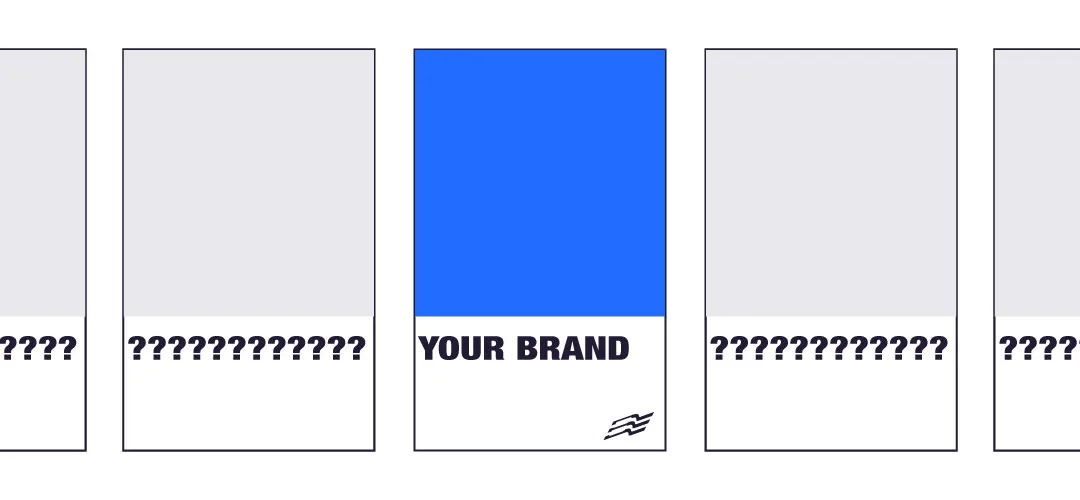
Repetition, on the other hand, is about creating consistency and unity. It’s like the chorus in your favorite song, repeating to create a rhythm and tie the piece together. By repeating certain design elements—be it a specific color, a shape, or a style—you reinforce the identity of the brand and make the overall design feel cohesive. Repetition helps build familiarity; the more you see something, the more likely you are to remember it.
When you balance contrast and repetition in your design, you achieve a harmony that is both eye-catching and comforting. Contrast makes sure your key elements stand out, while repetition ensures that your design feels unified and polished. Together, they keep your visuals dynamic yet coherent, ensuring your message isn’t just seen, but also remembered.
Proportion and Movement
Proportion and movement are like the rhythm and flow of a dance in the world of graphic design. They manage how elements relate to each other and guide the viewer’s eye smoothly through a visual experience.

Proportion refers to the size and scale of elements in relation to each other. It’s like setting the table for a family dinner; you wouldn’t give your toddler the same size plate as an adult. Similarly, in design, larger elements are used to draw attention and signify importance, while smaller elements act as supporting details. Proportion helps balance the visual weight across the design, ensuring that everything is sized appropriately to their role and impact.

Movement, on the other hand, is the path the viewer’s eye takes through the design. It’s the storytelling part of your design, where you get to guide the audience through the content in a way that feels natural and engaging. Think of it as the way a good movie director keeps your attention focused on the right part of the screen at the right time. By strategically placing elements along natural sightlines and using directional cues like lines, shapes, or even the gaze of people in images, you can steer viewers through the design in a meaningful and deliberate way.
Together, proportion and movement ensure your design not only looks good but also communicates effectively. Proportion provides the visual hierarchy that prioritizes information, while movement ensures that the story you’re telling is easy to follow. This dynamic duo keeps your designs dynamic and effective, making sure that every glance has a purpose.

White Space
White space, often referred to as negative space, is like the breathing room in your design. It’s the space left unmarked; the empty areas around and between the elements of a composition. Much like the pauses in a speech that emphasize the spoken words, white space in design emphasizes and frames the visual components.
Think of white space as the canvas of your design—it’s not just empty or unused space. Instead, it’s a powerful tool that helps create a clean, uncluttered look. By strategically using white space, you can draw attention to the most important elements of your design, improve readability, and make the content more digestible. For instance, a webpage crammed with text and images might overwhelm a visitor, whereas ample white space can guide them naturally through the content, improving user experience and engagement.
White space isn’t just about aesthetics; it plays a critical role in the functionality of your design. It helps to balance out the more complex areas and gives your design a sophisticated look that suggests professionalism and credibility. In logos, advertisements, and websites, the intelligent use of white space can convey a sense of luxury, focus, and clarity.
In summary, white space is not something to be filled, but a powerful element to be strategically wielded. It allows the other elements in your design to breathe and can transform a good design into a great one. By mastering the use of white space, you ensure that your designs are not only pleasing to the eye but also effective in communicating your message.
Color and Space
Color and space are essential elements in design that work together to create mood, focus, and harmony in your visuals. Understanding how to use these elements effectively can transform a simple design into a compelling piece of communication.

Color isn’t just about making things look pretty; it has the power to evoke emotions and actions. Think of it as the tone of voice in which you speak to your audience. Warm colors like red and yellow can energize a design and evoke feelings of happiness and passion, while cool colors like blue and green tend to have a calming effect and are often associated with trust and professionalism. Selecting the right color scheme is crucial because it sets the mood for your design and helps reinforce your message. It’s also vital for brand recognition—consistent colors make your brand instantly recognizable and help you stand out from the competition.
Space, or the distribution of empty areas in a design, helps to define the relationship between the elements in your visuals. It’s like the spacing between words and lines in a book—it needs to be just right to make the content comfortable to read and easy to understand. In design, effective space management ensures that the viewer’s eye flows smoothly from one element to the next, without distractions or interruptions. It helps establish groupings of related items, and by manipulating space, you can either link elements together or separate them to emphasize their independence.
Using color and space effectively means more than just choosing beautiful shades and deciding where things should go. It’s about creating a strategic visual hierarchy that guides the viewer through the design in a way that is intuitive, logical, and enjoyable. Whether you’re designing a website, a brochure, or a brand logo, the thoughtful use of color and space can dramatically enhance the functionality and aesthetics of your project. By mastering these elements, you ensure that your designs not only catch the eye but also hold attention and communicate clearly.
Variety and Unity
Variety and unity are like the spice and the staple of design; they work together to keep your visuals interesting and cohesive. Mastering the balance between these two principles is key to creating designs that are both engaging and harmonious.

Variety is about adding interest and excitement to your design. It involves introducing different elements such as colors, textures, shapes, and sizes to prevent monotony. Just like a chef uses a variety of ingredients to create a complex dish, a designer uses varied elements to capture and retain the viewer’s attention. For instance, mixing typography styles or incorporating vibrant images alongside more subdued elements can make a layout pop and keep the audience engaged. Variety challenges the eye with new and unexpected features, making the design more dynamic and enjoyable.

Unity, on the other hand, is what holds these varied elements together in a coherent whole. It’s about creating a sense of harmony and compatibility among all parts of your design. Unity ensures that despite the diversity of styles and components, there is an underlying order that ties everything together seamlessly. This can be achieved through repeating certain colors or motifs, aligning elements to a grid, or using a consistent style for images and graphics. Unity provides a clear path through the variety, making the design feel organized and purposeful.
Combining variety and unity effectively means crafting a design that is both fascinating and orderly. The variety draws the audience in, sparking interest and curiosity, while unity makes sure they are not lost or overwhelmed. It’s like telling a story with multiple characters and plot twists that all converge into a single, satisfying conclusion. By ensuring your designs maintain this delicate balance, you make sure they are not only captivating but also easy to navigate and understand.

Applying Basic Graphic Design Principles In Small Business Marketing
When it comes to small businesses, applying graphic design principles effectively can significantly enhance marketing and branding efforts. Here are practical tips on how to use these design principles in real-world scenarios:
1. Leverage Contrast for Call to Actions
Make your calls to action (CTAs) stand out with high contrast. Use bold colors against a subdued background or vice versa to make the CTA buttons on your website or flyers impossible to miss. This use of contrast ensures that your most important messages or actions are the focal point, encouraging more customer interactions and conversions.
2. Use Repetition to Build Brand Recognition
Consistency is key in branding. Repeat key elements such as your logo, brand colors, and fonts across all marketing materials, from your business cards to your website and social media profiles. This repetition will help cement your brand identity in customers’ minds, making your business more memorable and recognizable.
3. Implement Hierarchy in Menus and Price Lists
Structure your menus or price lists using hierarchy to guide customers through your offerings smoothly. Highlight best-sellers or premium products using larger fonts or different colors. This not only makes the information clearer and easier to read but also strategically steers customer attention to the items you want to sell most.
4. Balance in Layout Design
For your marketing materials, such as brochures and advertisements, maintain balance to keep the design pleasing and effective. If you’re using large, eye-catching images on one side, balance them with substantive text or additional visuals on the other. A well-balanced layout appears more professional and is easier for customers to engage with.
5. Utilize White Space in Web Design
Don’t clutter your website with too much information. Use white space generously to create a clean, uncluttered look that makes it easier for visitors to navigate your site. Adequate white space enhances user experience by reducing cognitive overload, which is crucial for keeping potential customers engaged and focused on your content.
6. Proportion in Promotional Materials
Ensure that the most important elements of your promotional materials are proportionally larger to draw immediate attention. For example, if you’re running a sale, the discount rate should be one of the most prominent elements on the poster, drawing people in and clarifying the benefit right away.
7. Create Movement in Visual Storytelling
Use the principle of movement to guide the viewer’s eye across your marketing narratives. Arrange content so that visual elements lead from one to another in a logical flow — for instance, from a compelling headline to a striking image to an irresistible call to action. This ensures a story-like progression that captures and holds attention.
By integrating these design principles into your marketing and branding strategies, your small business can create more effective and aesthetically pleasing materials that not only attract but also retain customer interest.
Conclusion: Harnessing the Power of Design in Your Business
To thrive in today’s competitive marketplace, understanding and applying basic graphic design principles is not just beneficial—it’s essential. By leveraging elements such as balance, alignment, contrast, and repetition, you can dramatically enhance how your brand is perceived and interacted with by potential customers.
We’ve explored how using contrast can make your calls to action pop, the importance of repetition for brand consistency, and the effectiveness of proper alignment and hierarchy in organizing information. Implementing these principles can transform your marketing materials from good to great, ensuring they are not only visually appealing but also strategically effective.
Are you ready to take your small business’s visual identity to the next level? Consider how you can apply these design principles to your current marketing strategy. Or, if you’re looking to dive deeper and truly transform your business’s visual approach, why not schedule a consultation with us at Beyond Lines? Let’s create something visually stunning and strategically sound together!